


Leading a design system website restructure initiative for the largest online retailer in Switzerland.
As a Senior UX Designer on the Design System team at Digitec Galaxus, Switzerland's largest online retailer, I led a restructure initiative to improve the usability and visual design of our public-facing design system.
2024 – 2025
Digitec Galaxus
Senior UX Designer
Challenge
The existing design system website was difficult to navigate with duplicate or missing content, hindering both internal and external users from finding relevant information. Additionally, a visual refresh was needed to reflect our brand's commitment to quality and stand out as an industry leader.
Research
It all began with the basics: 1:1 conversations to understand the goals and pain points of my fellow team members, our internal users. With the problem clearly defined, I transitioned to researching leading design systems, gathering user insights through a survey and leading ideation workshops with target user groups.
The workshop participants were asked to consider the following “How might we” statements to help frame their thinking and ideas:
- HMW help our users more easily find what they’re looking for?
- HMW make it easier for us to know where to add new content?
- HMW make our Design System stand out as an industry leader?
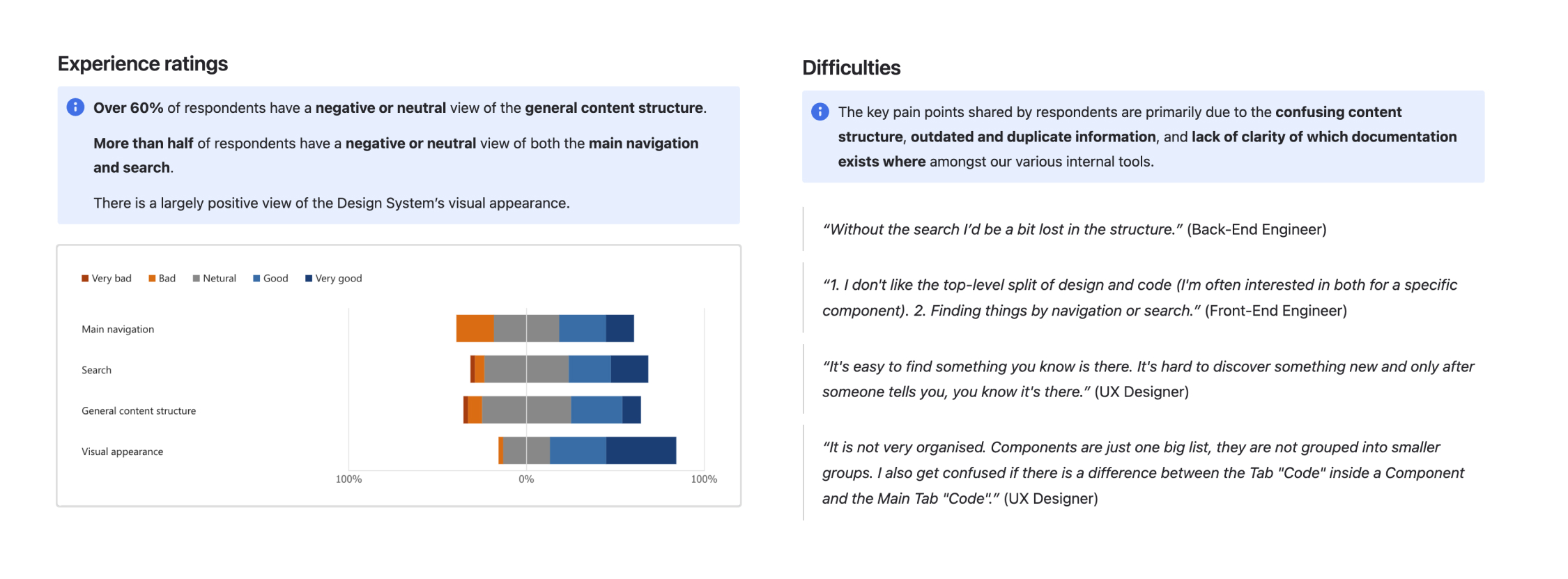
 A sample of insights I documented from my internal survey which received 46 responses.
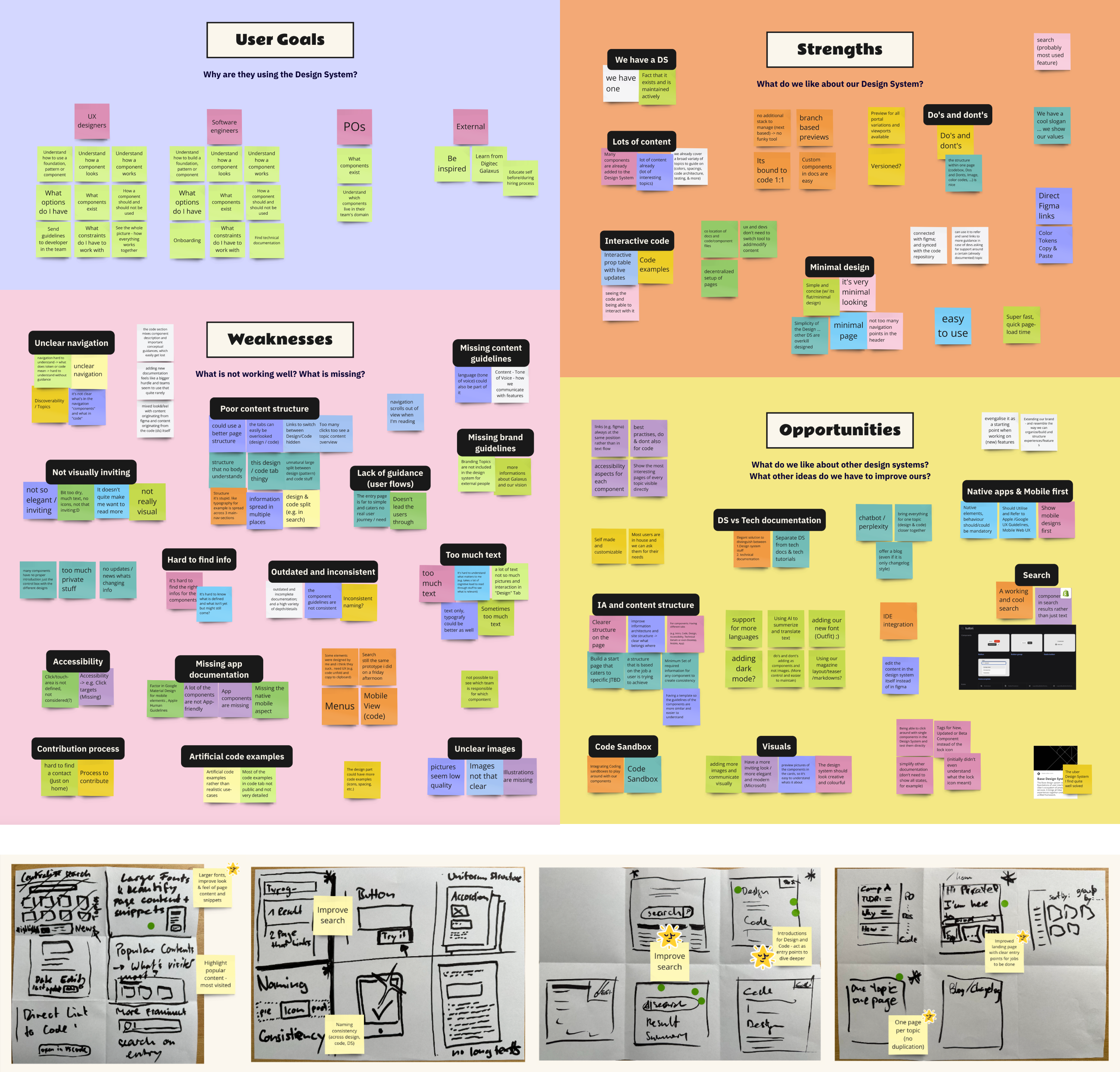 3 workshops were conducted for 3 small groups, after which I summarised the user goals, strengths, weaknesses and opportunities. Using a quick sketching exercise called “Crazy 8’s”, the participants iterated on the initial brainstorming and visualised their ideas.
I identified four key opportunity areas:
- Content organisation
- Global search functionality
- Missing documentation
- Visual design uplift
Ideation
Based on my research I created several personas and user journey maps, and visualised the jobs-to-be-done.
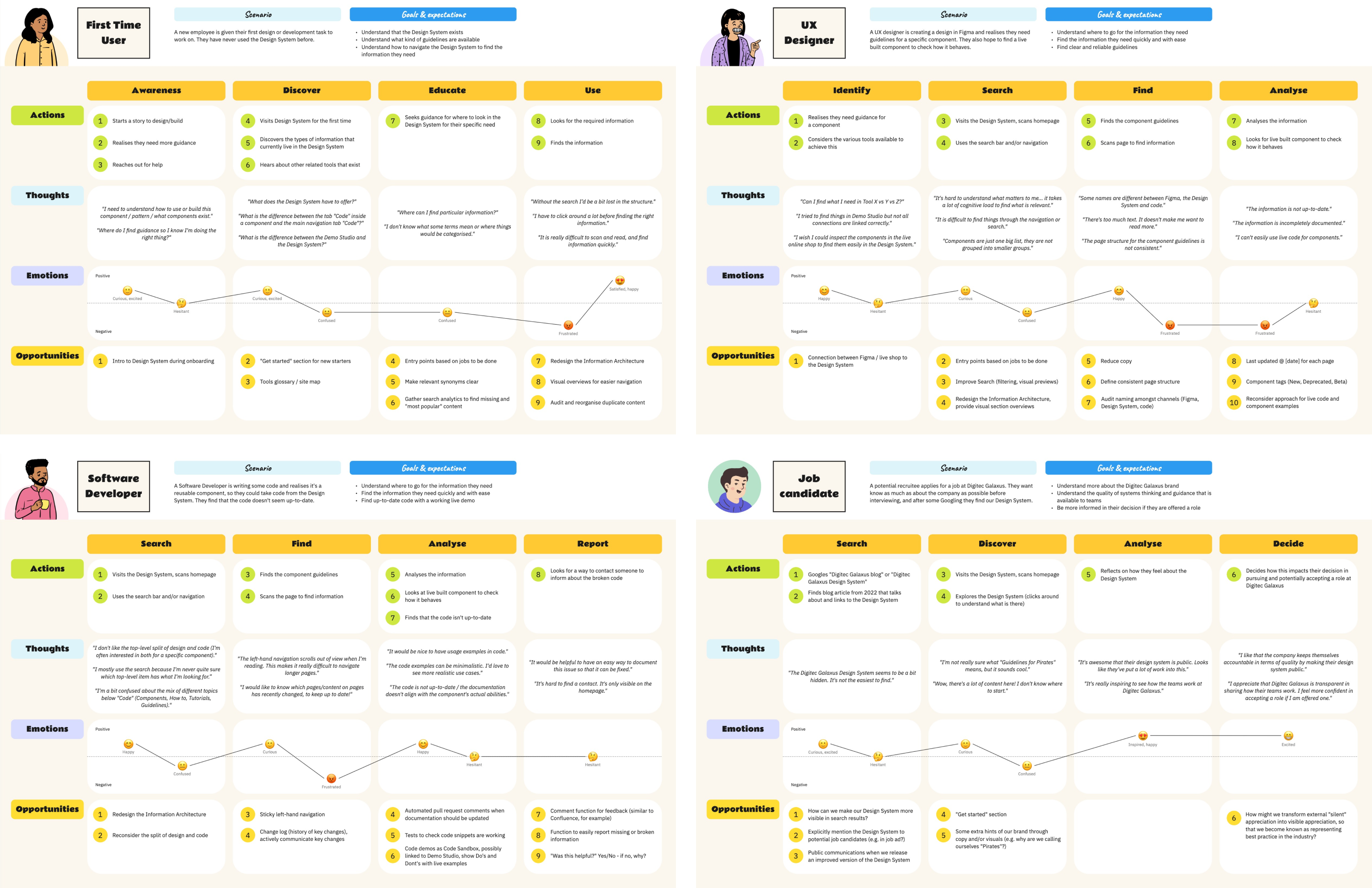 The user journey maps were based on four key personas and visualised the actions, thoughts, emotions and opportunities per journey stage. Each set of journey stages is unique to each persona based on their goals.
It was important that I wasn’t working in silo so I frequently shared design progress, aligning with my team to gather feedback and address technical constraints.
I led team ideation workshops for the two largest features of the initiative: our global search and Information Architecture (IA). Due to the large number of ideas generated for search, I conducted an Impact-Matrix session to agree on what we should build.
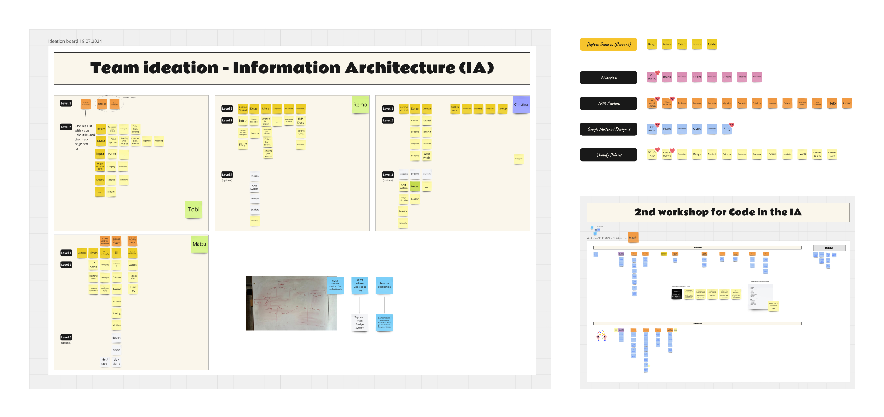 Samples of working notes from Information Architecture research and ideation workshops.
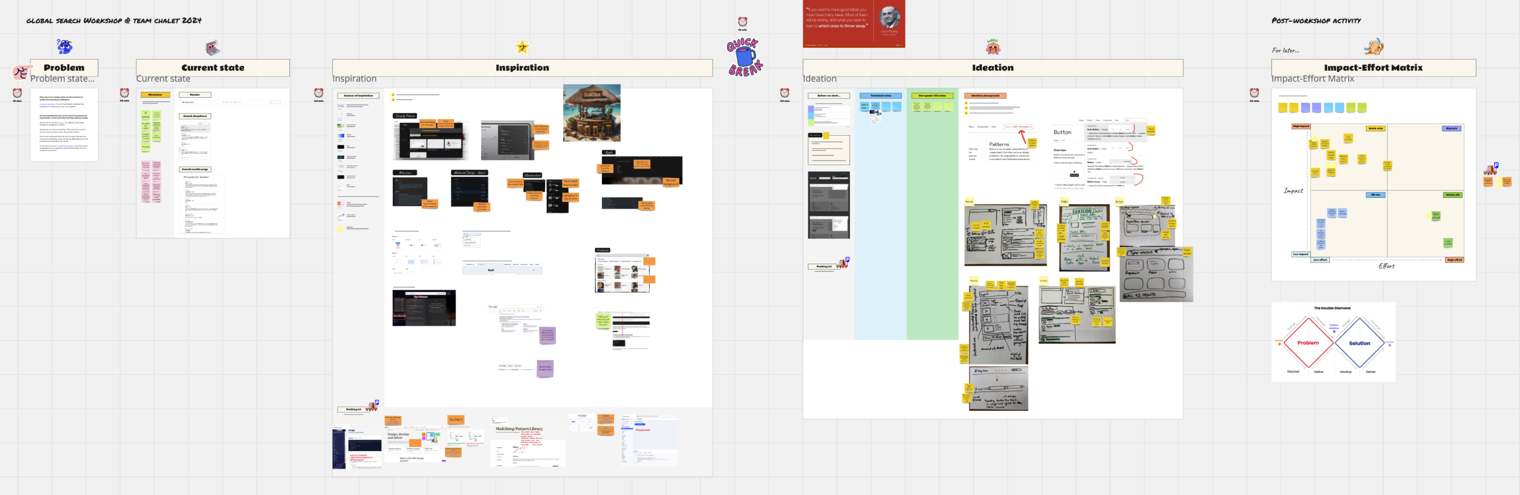 Overview of working notes from the Global Search workshop. The problem statement incorporated insights from the initial survey and workshops.
Testing
After further best practice research, internal interviews, and several rounds of feedback on the IA from business stakeholders, I worked closely with our UX Researcher to create a Tree Test to evaluate our proposed IA.
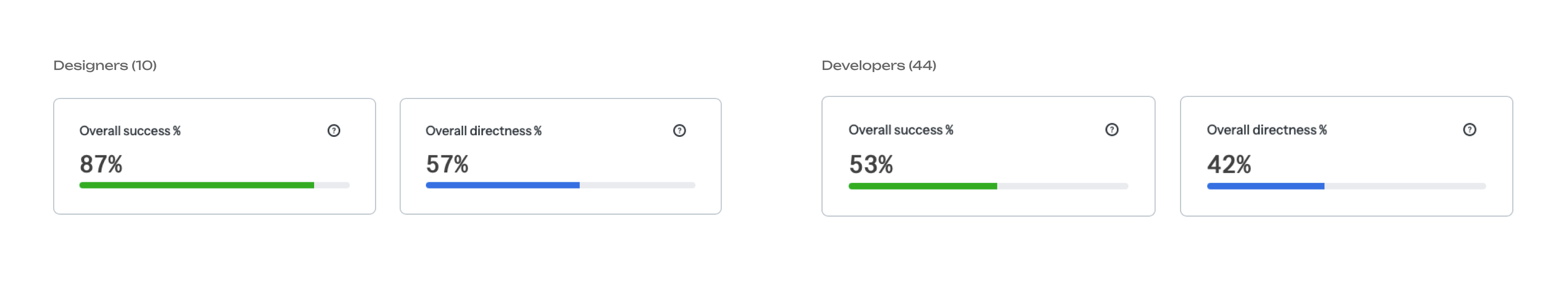
The biggest challenge we had to address was ensuring that the IA met the needs of both designers and developers, as the developers struggled significantly more than designers to find pages in our proposed IA. Beyond identifying opportunities for renaming and restructuring, we discovered that some developer documentation might be better suited outside the design system altogether.
 Research suggests that users are 2 - 3 times more likely to find the correct destination when the first click is correct. The poor directness scores were initially surprising. It was a good reminder that after a lot of brainstorming and ideation, you may think you have the best solution, but your users can prove you wrong.
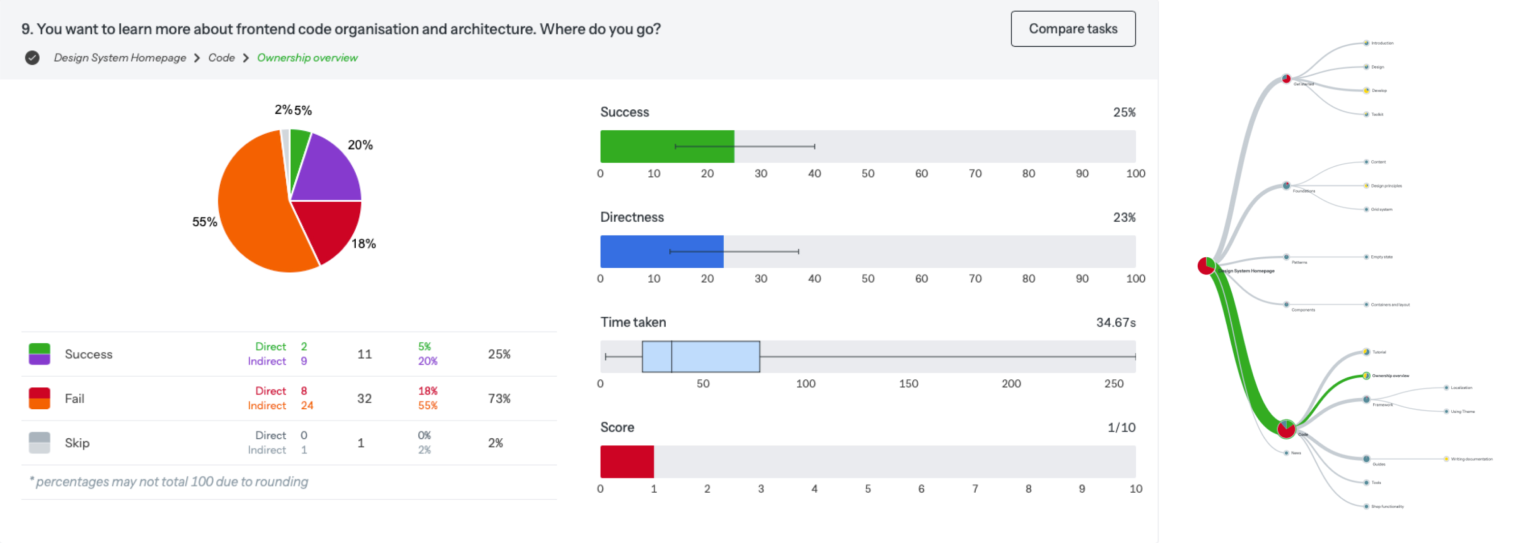 Most developers who went to “Code” first, didn’t select the right subpage. Many developers searched in “Foundations”. This helped us write a How Might We statement: HMW make it clear what to expect in “Code“? We changed “Code” to “Develop” so that it more holistically described the section’s content, but it raised a bigger question: Does this section belong in the design system?
Key learnings
The developers initially mistook my wireframes for final designs, so I reassured them that the wireframes were exploratory and collaborated closely with each developer to incorporate their feedback. I learnt that keeping wireframes as low-fidelity as possible is key to encouraging technical input in the early stages.
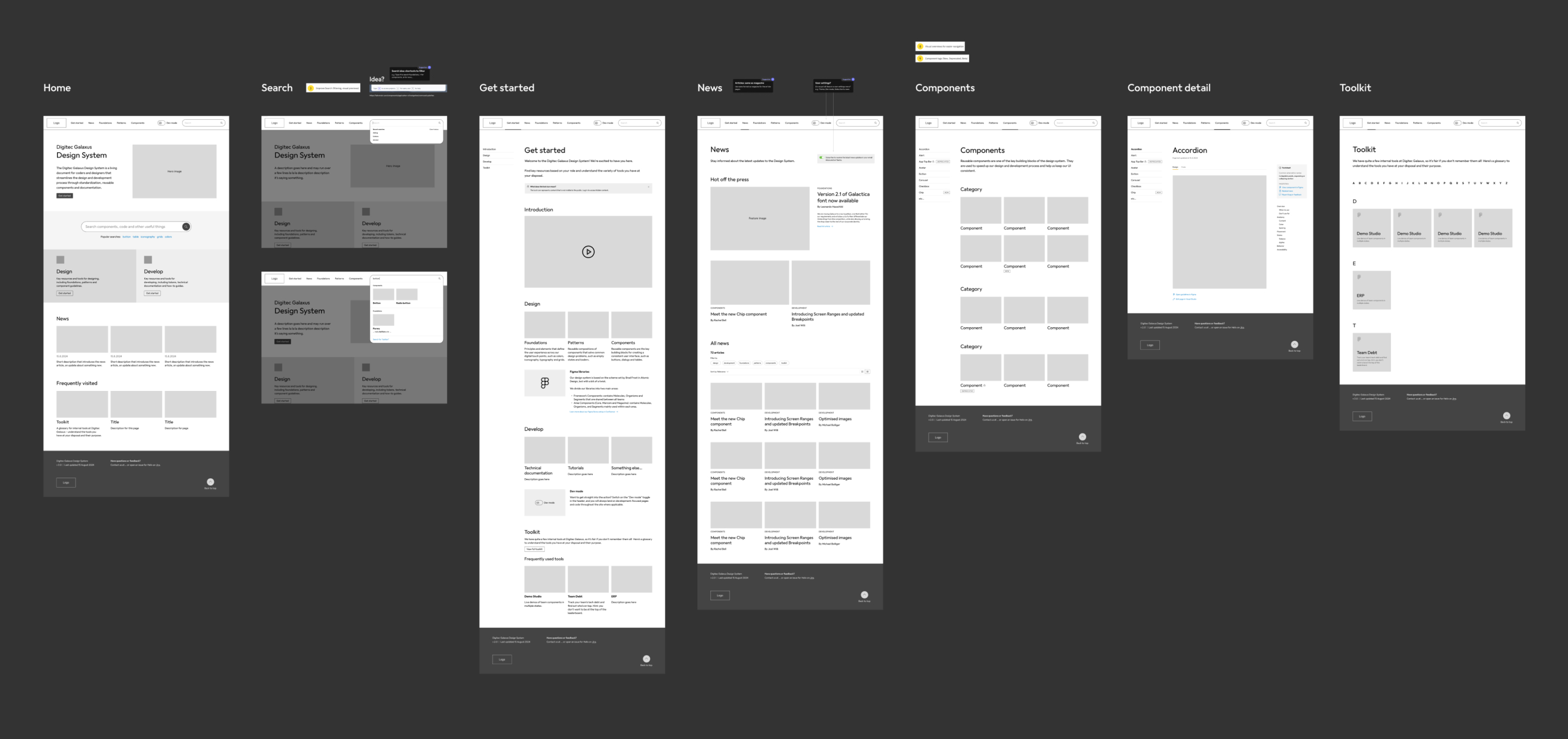 Early explorative wireframes. With the team’s feedback, we refined scope by focusing on high-value, technically feasible features. We also ran a scope-mapping exercise using the user journey stages.
Redesigning the IA helped me to understand the nuances of structuring a design system for two intertwined yet distinctly different user roles. The inclusion of complex developer documentation in a design system presents an interesting challenge when tackling IA issues for designers and developers. It also comes to a point where one must adhere to certain design system standards and an education initiative is required.
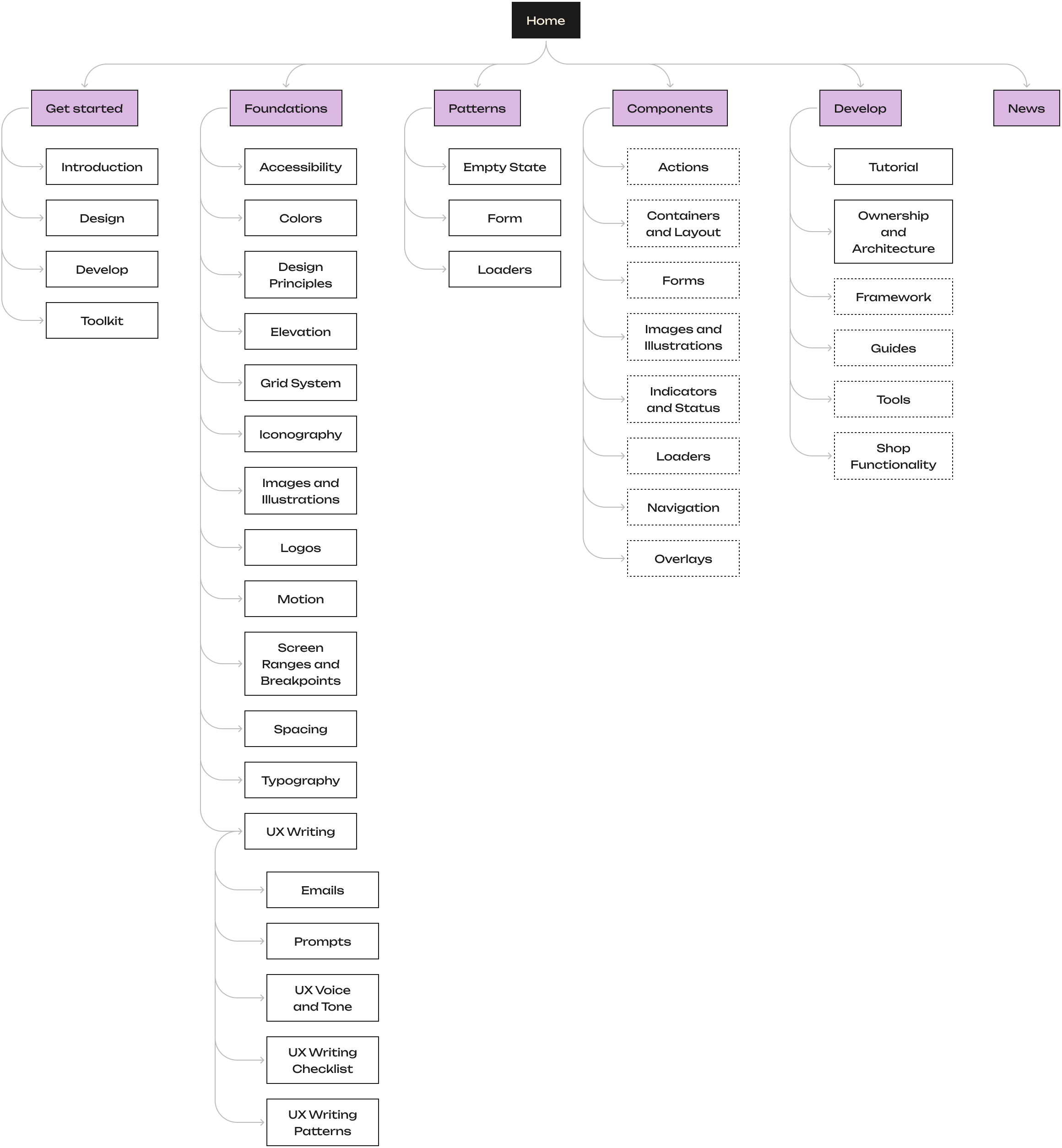 Final IA for the design system. The dotted lines represent categories that the component and development pages are sorted by, which were introduced to improve ease of navigation compared to the original alphabetic sorting.
Result
Over the course of this project, I facilitated:
- 6 ideation workshops
- 6 user interviews
- 1 Tree Test
Deliverables included:
- 3 personas
- 4 user journey maps
- 1 new Information Architecture
- 20+ polished designs for mobile and desktop
- 60 image thumbnails
- 5 custom icons
I’m proud of the level of cross-company alignment and collaboration I achieved for this initiative – especially when the rest of my team is just as excited about the new design system as I am!
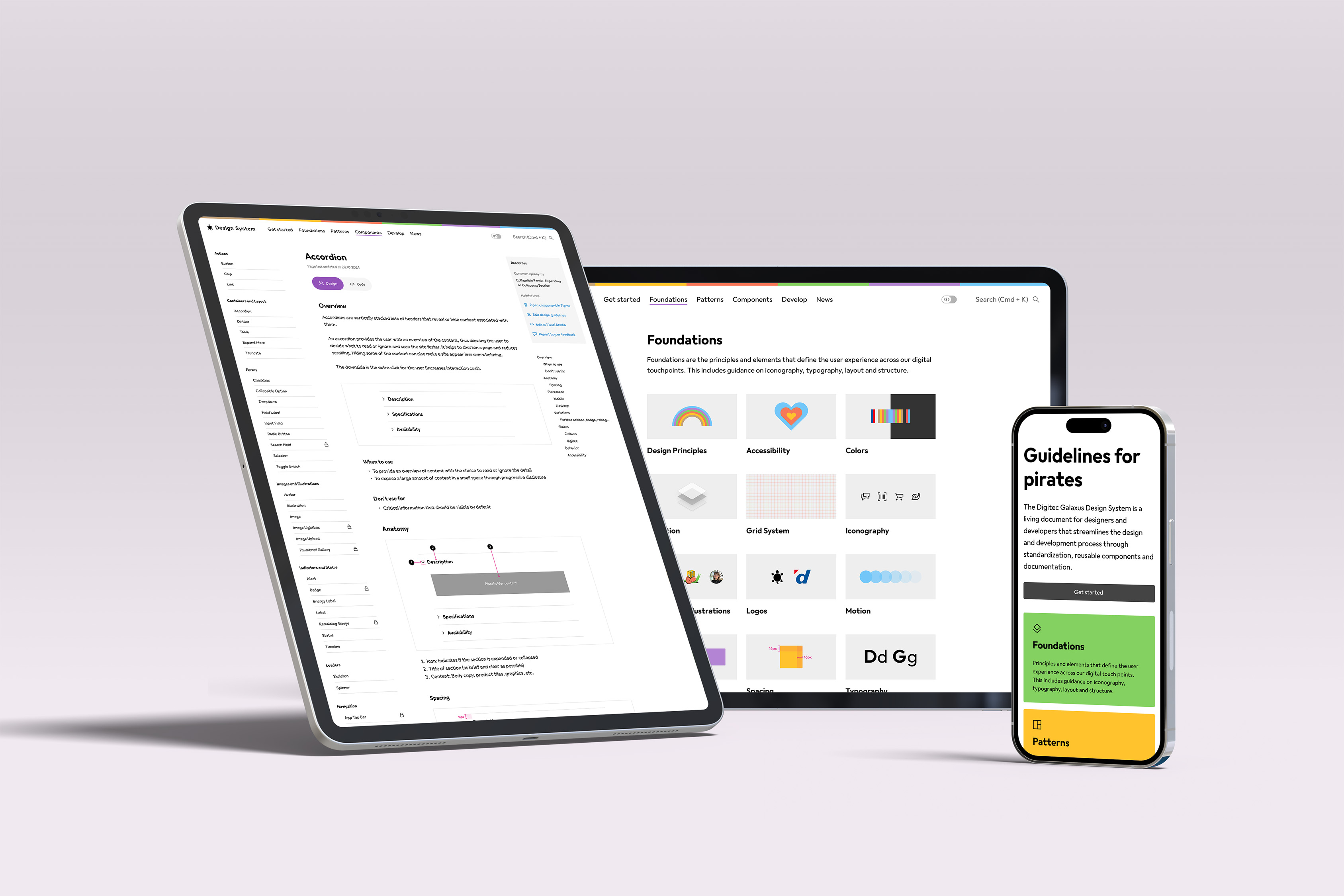
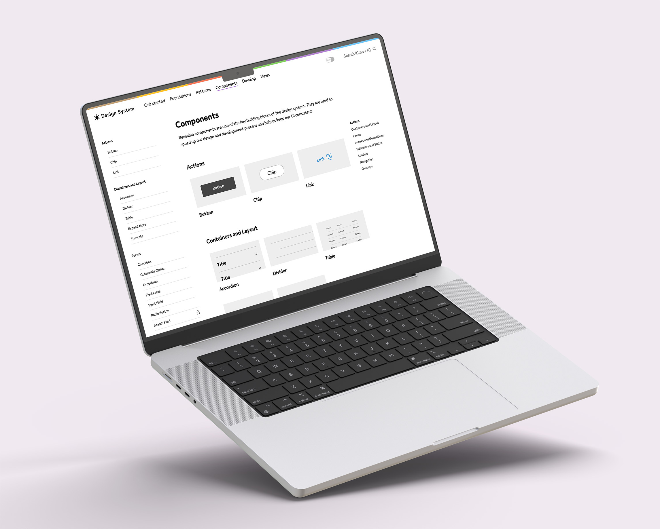 New visuals and categorisation (in the side navigation and main content) for the Components section, to help users more easily find what they’re looking for.
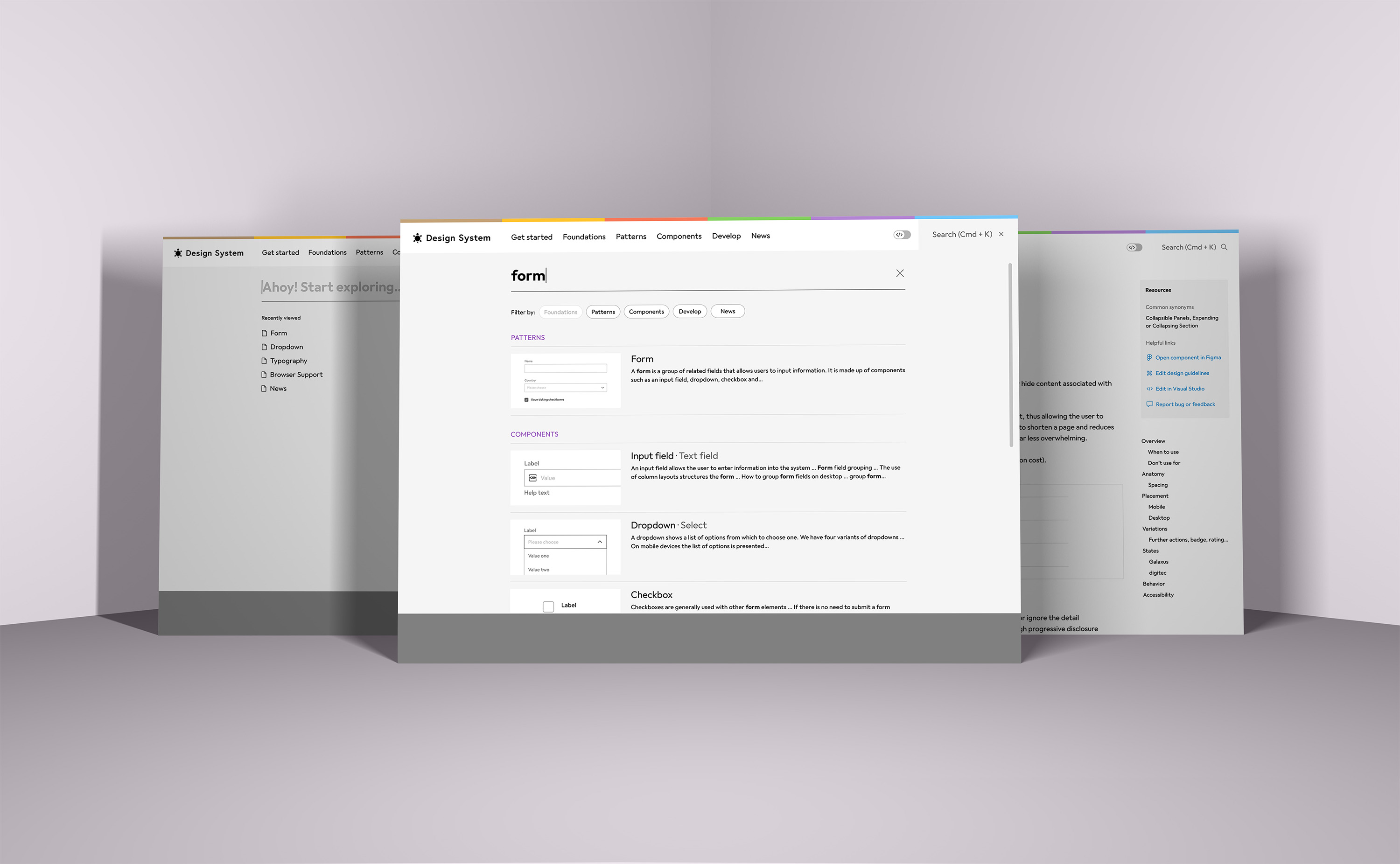 A completely new experience for the Global Search. A full-screen design draws focus to the results, and image thumbnails aid in scanning of information. Component synonyms are included in case users search for a similar but different term. These are also displayed on the Component detail page.
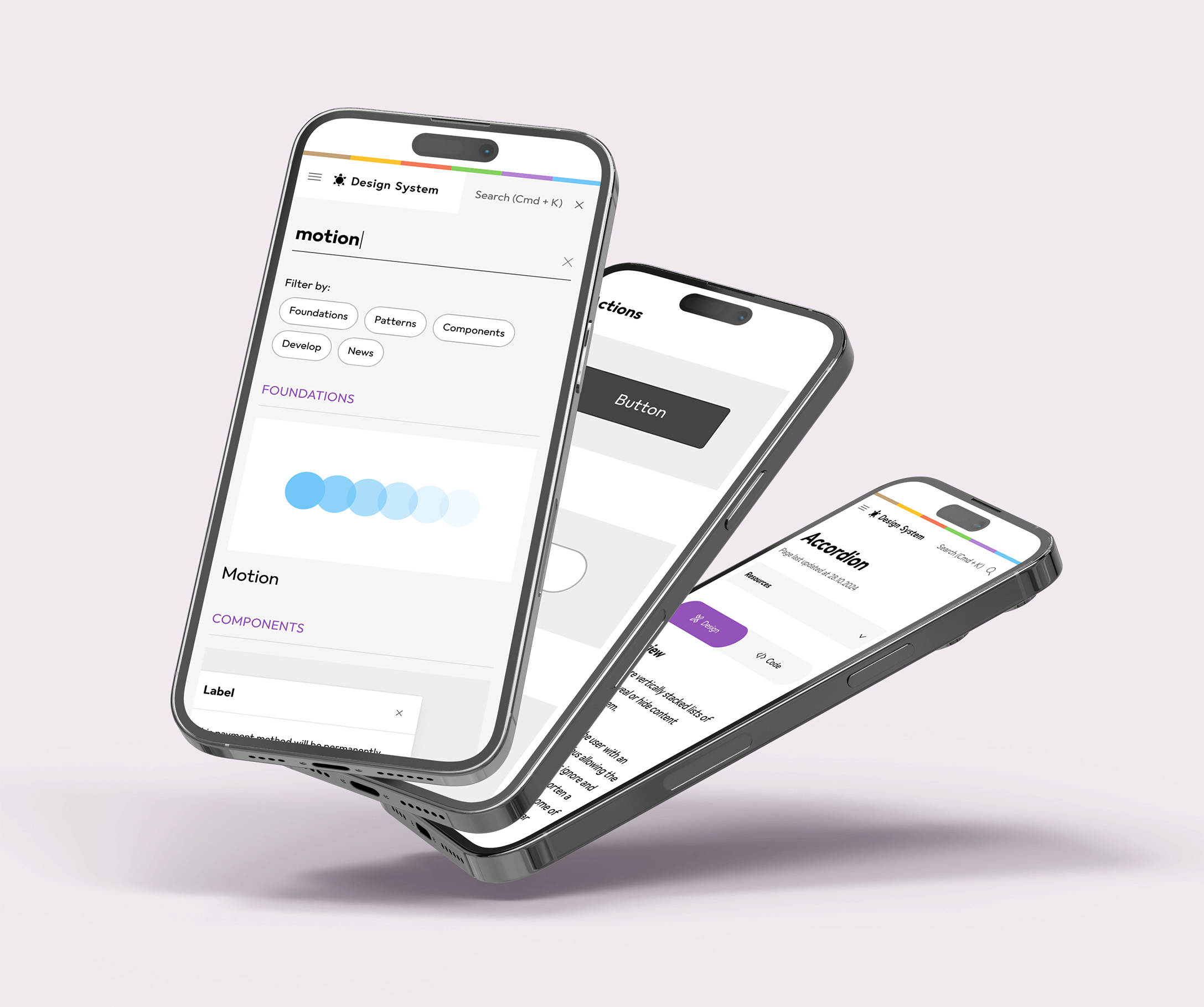 The design system is completely responsive and certain features were customised for mobile, such as removing descriptions in the search results and collapsing secondary information into an accordion.